Showing posts with label Terry Beatty. Show all posts

Sunday, September 18, 2011

Bela's got a brand new head

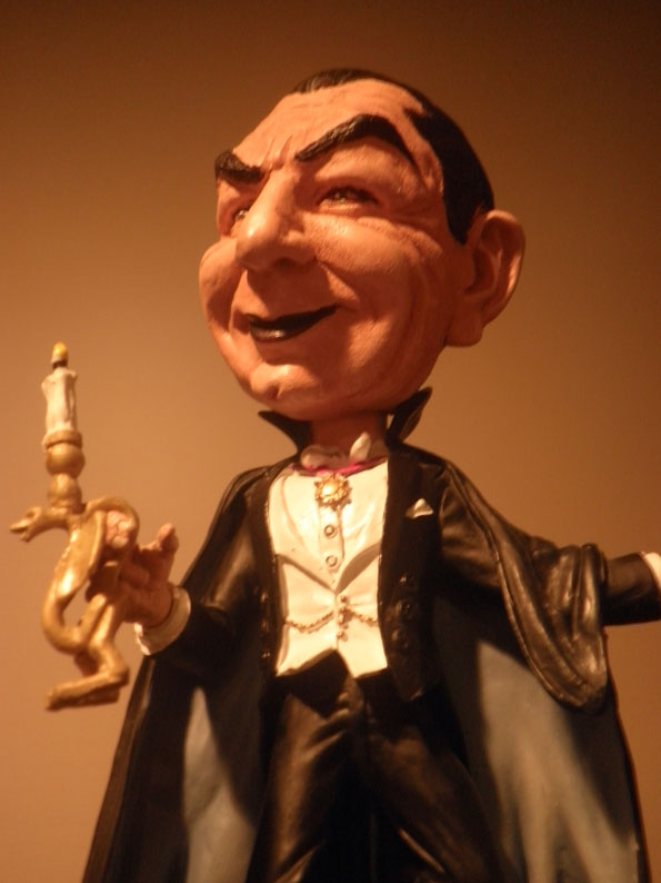
Here's a personal project I'd been wanting to do for some time. below you see a promo pic of a remarkably well sculpted Bela Lugosi head on a "nodder" or "bobblehead" produced by Neca. That's a Ray Santoleri sculpt -- and it's just fantastic. But it's always bothered me that this wonderful realistic portrait of Bela was attached to this cartoony nodder figure. I had it in my head that Ray's Bela would look great as a bust -- and that the nodder could use a more appropriately cartoony head.

This is in no way a criticism of Ray's work -- it's amazing -- but I couldn't resist the notion of turning this cool piece into two cool pieces!

The only problem was, that the nodder was out of production and hard to find at an affordable price. I mentioned that I was looking for one on the Universal Monster Army website -- and much to my surprise, my UMA pal, Packy, gave me his as a gift! The nodder has been sitting on a shelf "as is" for some time -- and this weekend I decided it was finally time to get started -- so, off came his head!

Now I should have taken a "before" picture -- as the head on my nodder was not quite as well painted as in the prototype pic here (snagged off the web somewhere).

And here's Ray's Bela head, removed from the nodder and hit with a coat of primer, so it can eventually be repainted.
This is my cartoony replacement -- sculpted in polymer clay (Super Sculpey) -- sorry that the pic is a little blurry.
And here it is, placed on the nodder. You'll note that it's considerably bigger than the original. I felt that was more in keeping with the tradition of the sort of "big head" caricature style I was going for here. I'm quite pleased with the end results, and hope you'll think it's nifty, too. Making the original head into a bust will have to wait, as I have other work on my plate, and I've taken up too much time for now with this personal project. But one of these days there will be a "Part Two" post for this project!

And before we get on with the pics of the end results, a reminder that I am available for commercial sculpting work and private commissions -- I can be reached via the contact links at my website.




Saturday, July 16, 2011

Green Lantern in styrene


We're fairly well settled into our new digs in the Kansas City area, and I'm back to work after finally getting my studio re-assembled. I'll eventually post some pics of the new workspace and my various collections on display there -- but for now, here's one of my latest projects.

This soon-to-be-released Green Lantern model kit from Moebius was designed by me, and I did the box illustration as well. The kit prototype was sculpted by Joe Laudati from my drawing. I'm thrilled with the end result -- as I wasn't even sure this pose was possible!

As this was intended to be the Silver Age Green Lantern, I leaned on Gil Kane's original design as much as possible -- the robot on the base is even a Kane-style 'bot. The box art was meant to invoke the Aurora kits of the '60s -- and I hope it'll fit in well on kit collectors' shelves next to Wonder Woman, Superboy and the others.

This is a kit that I've wanted since I was a kid -- so it was a special treat to be involved in ins creation. My thanks to Frank at Moebius for inviting me to contribute to the process.

Now that the craziness of the move has settled down, I hope to be back to posting regularly here. Please check back often to see new posts -- thanks!


Tuesday, April 12, 2011

Is the end of "The Road" ahead?

If you've been wondering why this blog hasn't been terribly active lately, it's because I'm busy finishing up the art for the last section of Return to Perdition. This is a 180 page graphic novel from Vertigo Crime, written by Max Collins -- chronologically, the last story in the Road to Perdition saga.

As of this writing I still have a hefty chunk of pages to finish -- but the book is now available for pre-order and has an August publication date. Amazon has it listed with the black and white mock-up cover shown below. This is not the actual cover -- but as a promo piece, I think it looks pretty cool -- and does use some of my interior art from the book.

The actual cover is the color piece shown at the bottom of this page -- a wonderful illustration by Lee Bermejo that harkens back to the origins of the Perdition tale. Our story brings the action up to the 1970s, and brings a new generation into play.

I don't want to turn this into a commercial -- but I am rather proud of what Max and I are doing with this project and think it'll be well worth your time if you're at all a fan of our previous work. I'm drawing in a different style than usual -- meant to reflect the edgy nature of the story -- and doing a lot of the drawing digitally. At the pre-order price, it's a heck of a bargain.

And now if you'll excuse me for a while -- I have to finish the thing!


Saturday, September 11, 2010

Influence Map Take Two!

There weren't enough spaces on my first try at this to show everything. So I did a second one. And I still have stuff that's missing....

Monday, February 22, 2010

SCARY MONSTERS A-GO-GO!

Another Scary Monsters wraparound cover illustration done!  This is pencil, ink and Photoshop -- not a bit of paint, this time.  All images are from the ultra low budget flick,Monster A Go-Go!

My "Wolfmen" cover  for Scary Monsters #72 has been nominated for a Rondo Hatton Award -- you can see the ballot HERE.

Thursday, December 10, 2009

TBG Christmas cover 1982

In the early days of my comics career, I was a regular contributor of cover art to Alan Light's weekly fanzine, The Buyer's Guide for Comic Fandom.  I'm not sure how many covers I drew for TBG over the years (though someone did send me a checklist once -- which I'm sure is packed away somewhere in some box in my storage closet) -- but I only kept the original art for a handful, and this Christmas cover below is one of them.  This scan is of the original -- the color added version done in Photoshop, after scanning the original color mask overlay.  I did at least one more Christmas cover.  If I can find it before Christmas, I'll post it, too. 

The comics and toys are items from my own collection that I thought collectors might enjoy finding under a Christmas tree.  I've since sold that Daredevil #1 (darn it!) -- but still have the rest of this stuff.   Shortly after publication, Milt Caniff  sent me a postcard telling me he enjoyed seeing the Terry and the Pirates characters on this cover!


Tuesday, September 8, 2009

"Hey Kids, Comics!" -- my "Big Funny" strip

Since the Big Funny art show has come to an end, I'm sharing my comic strip with you here.  Big Funny, the publication, is still available, click HERE for info.  Big Funny illustrated logo by Zander Cannon.  Comments appreciated, as is your listing a link to this blog on yours!  Click on the comic for a larger view.


Saturday, September 5, 2009

Is he cranky or crusty -- seems I don't even know!

These comic strips were drawn during my cartooning classes at MCAD.  One assignment I gave my students was to take a piece of 8 1/2 x 11 paper and draw a complete comic strip in thirty minutes.  The object was to focus on telling a story (or a gag) -- and not worry about doing the greatest drawing ever -- just get the content on the page.  And rather than just look over their shoulders while they worked, I drew one, too.  Or two, too, if you will -- as we did this assignment in more than one class.  

My strip features the "Cranky (or Crusty) Old Coot" in adventures that roughly parallel events in my own life.  Though I never kicked a cat, as the Coot does.  By the way, that hole in the apartment ceiling still wasn't fixed when I moved out a year later!  All in pencil -- darkened up a bit in Photoshop for easier reading.  Click on 'em for a bigger view.


Wednesday, August 26, 2009

Wolfmen!

I've just finished the wraparound cover illustration for the 72nd issue of Scary Monsters magazine.  For those who've wondered why this blog is "Scary Terry's World," -- this is why -- for more than a decade, I've been providing art for this mag, and since Scary and Terry conveniently rhyme, the nickname was inevitable! 

After years of painting these covers in acrylics on illustration board, pasting up copy on an overlay and shipping it all to the publisher in a big bulky cardboard box, I'm now experimenting with new ways to work, and making the final cover in Photoshop -- delivering the piece electronically.  Yes -- I know it's a shock to some, but I'm digging this 21st century technology.  

For this werewolf themed cover, I searched the web for images of Oliver Reed in the Hammer Studios movie, Curse of the Werewolf, and used a flopped version of a frame from the film for my preliminary drawing -- also referencing other stills and promotional photos for details.  The Lon Chaney Jr. Wolfman images came from still-frame screen images.

I started with pencil drawings on vellum -- shown here in their original black and white state.  The next step was scanning them and playing with color and contrast in Photoshop.  For Lon's Wolfman, I gave the linework a rich brown treatment, with a pale yellow in the highlights.  For the Oliver Reed Werewolf, I went with a deep blue, and then using the airbrush tools, added pinks, purples, reds and yellows under the linework.

The final step was to combine the images and add copy, logo and plug in the mag's mascot, Sam Scare.  

Click on the images for a larger view!

Next on the drawing board -- finishing up a few commissions, drawing a band gig poster and starting a major new project that'll keep me occupied for six months at least....


Tuesday, August 11, 2009

Pencil/ink/color/print.

Today we have a series of images showing the process behind my cover illustration for A Killing in Comics, the first of the Jack and Maggie Starr comics mysteries by Max Allan Collins.  There were a few rough preliminary sketches before this pencil prelim.  The drawing style is inspired by 1940's DC Comics in general -- the Batman newspaper strip, specifically.

Image #2 shows the inked and cleaned up line art.  My favorite inking tool is the Niji "Waterbrush" (the large size) filled with Rapidograph "Ultradraw" ink bu Koh-i-noor.

  This is followed by the colored version in #3.  Melissa Kaercher did a great job (from my color notes) on the faux '40s comic book color --big dots,  bad registration and all!  And finally, there's the printed version of the book cover, incorporating a slightly cropped version of the art.

My cover illo for the second in the series, Strip for Murder, was a painting, incorporating some cartoon art.  Unfortunately, the series came to a halt before the planned third book, which would have had an EC horror comics theme.  Darn it -- I was really looking forward to illustrating that one.  Heck -- I was really looking forward to reading it!  Some day, if luck is kind, Max  and I will be able to return to this series.  In the meantime, we have other things planned....


Saturday, August 8, 2009

Inking the "King"

Now that Big Funny has made its debut, I'll get back to posting more of my work, as well as various graphics and assorted "cool stuff" that I find worth sharing.  Today I'm bringing you a few examples of my inks over lightboxed Jack Kirby pencils from Jack's  "Heroes and Villains" sketchbook.  

These were initially done as an inking exercise -- but I ended up using them in a birthday greeting to Jack published in a San Diego ComicCon convention book.  Later, just for the heck of it, I colored them.  The originals were sold at auction in a 9-11 benefit at another convention.

I recently discovered these scans which I hadn't recalled making.  I'm glad I found them -- a nice surprise for me -- and I hope you enjoy them, too.  The experience of inking Kirby's pencils is such a pleasure for me -- I wish I'd been able to have really worked on something with him.


Thursday, July 2, 2009

More Wild Dog!

Sorting through my files, I stumbled across these Wild Dog cover roughs that I'd completely forgotten about.  Well, it was two decades ago, y'know! These are all very different from the final cover of the Wild Dog Special (WD behind bars).  Drawn with marker on typing paper.


Tuesday, June 23, 2009

The Secret Origins of Wild Dog!

Shown above is Ed Hannigan's rough design for the cover of the first issue of the Wild Dog mini-series.  You didn't know he designed that, did you?  Ed did a lot of uncredited design work for DC over the years -- and all four of the Wild Dog mini-series covers are from his designs.  A very (extremely!) belated "thank you" to Ed!

Max Allan Collins and I created Wild Dog for DC Comics some twenty-two years ago.  We produced a four-issue mini-series, a one-shot special, and several serialized stories in the ill-fated Action Comics Weekly.  That was it.  Wild Dog had a short and sweet life.  Hugely popular in the Quad Cities area where the series was set, it never quite caught on big enough with the rest of the country to continue.  Still, DC maintains ownership of the feature, squeezing WD into some company-wide crossover every few years -- for just a panel or two.

Several years after the initial run, Max and I pitched a revival to DC -- specifically to (much missed) editor Archie Goodwin.  We had some good talks and I did a few drawings - but eventually we decided DC wanted so many changes to the core concept that it wasn't working for us anymore, and we went on to other things.  We never did work on anything for Archie, darn it.

But despite his short time on the shelf, Wild Dog still has a (pardon me for saying it) rabid following.  When I (very) recently dipped into my "keeper" art files to sell some original comic art I'd held onto for years, it was the Wild Dog art, more than anything that caused a stir.

So, spurred by that interest, I started digging through my files for anything else Wild Dog related.  I found the material posted here -- most of which I'd forgotten I had.

Wild Dog began as "Machine," a name rejected by DC because of its similarity to "Machine Man," a Jack Kirby feature at Marvel. It seems we may have also considered calling him "Commando" for about two or three minutes....

After rejecting "Mad Dog," we settled on "Red Dog" as the character's name and proceded to put together a package to sell the series to DC.

A detail of the cover page for the 16 page series pitch written by Max Allan Collins.  The pitch ends with a suggestion that Max write the feature and I ink it over pencils by some classic silver age artist.  Thankfully, we all decided I should pencil the thing!


The first drawings of the cartoon dog mascot for Red Dog/Wild Dog's shirt.

Here's the evolution of the "pitch art" used to sell the series. He's still "Red Dog" here. I left the shirt blank on the second piece and made a stack of photocopies of it, on which I drew different versions of what would become the dog mascot design.


Logo concepts provided by DC.  I'm sorry to admit I've forgotten which talented letterer designed these.


Rough concept sketches for covers -- done when the feature was still being called Red Dog.  The first of these ended up being drawn -- but rejected by DC.  Eventually it was used as an Amazing Heroes cover.


"Red Dog" became "Wild Dog" after discovering a GI Joe action figure had already used the Red Dog name.  If we ever wanted action figures of the character, we'd need a name that hadn't already been used.  Never did get those action figures, darn it.

Preliminary roughs for a few Action Comics Weekly pages and photocopies of pencils for an ACW page and two of the mini-series covers  are shown below.


I hope you enjoyed seeing some of this long-hidden material.  Who knows if Wild Dog will ever return -- but I'm grateful that after all these years, his fans still remember the series fondly.  Stay wild, kids!