Wednesday, June 30, 2010

Williamson and Frazetta's FORBIDDEN WORLDS

As a kid, reading as many comics as I could get my hands on, I never warmed to ACG's Forbidden Worlds. By the mid-60's the slick artwork by Ogden Whitney, Pete Costanza and Kurt Schaffenberger that was found in its pages seemed a little too squeaky clean for me. I'd gotten used to the more dynamic approach of Kirby and Ditko -- and the rough-edged work of Joe Kubert and others. Today, of course, I appreciate their slick, professional work and solid craftsmanship. But the early issues of Forbidden Worlds, published before I was born, are a whole 'nother story.

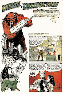
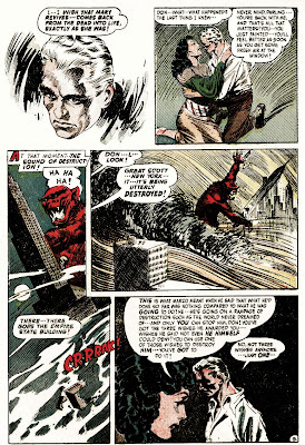
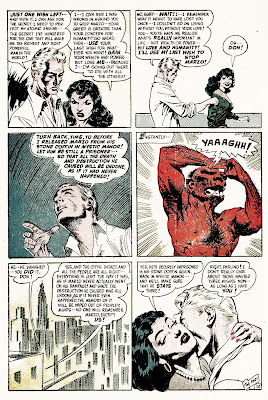
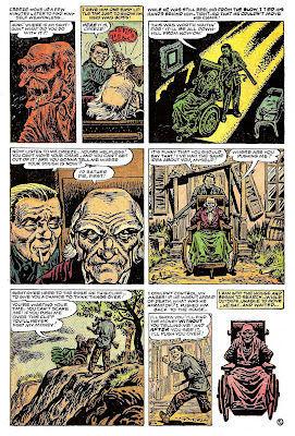
As noted in recent posts, the internet seems to be buzzing with scans of vintage comics, and recently I've been working my way through a long run of Forbidden Worlds. I was surprised to see that the early issues contain a very mixed bag of artwork -- some of it, frankly, pretty darned bad. But the less than stellar artwork is more than offset by some surprisingly strong entries. The first issue, from 1951 (Ken Bald's cover shown below), contains a collaboration between artist friends Al Williamson and Frank Frazetta. Though signed only by Williamson, Frazetta's hand is clearly evident here.

As with the Joe Maneely posts of the last few days, I've cleaned up these scans. The original comic had tanned badly and the four color printing was terribly off register. I couldn't fix everything -- but did do considerable work so that the drawings of these two remarkable artists could be seen to better advantage. We lost both of these comics legends recently -- but there's no question that fans of comics and illustration art will continue to admire their work for years to come. Though its an example from fairly early in their careers, Demon of Destruction is, nevertheless, full of the romantic/heroic imagery and remarkable linework that made both artists favorites of comics fans all over the world.

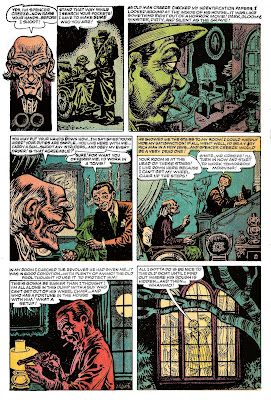
While Williamson and Frazetta are well known names in the comics world, Forbidden Worlds did feature some surprisingly strong work by artists largely unknown to most comics fans. I'll have more to say about that soon.


Tuesday, June 29, 2010

More Maneely!

Here's another vintage Lee/Maneely story. Seems Stan must've been fed up with the anti-comics sentiment of the day. Enjoy these cleaned up scans of "Raving Maniac."

Do you think those are portraits of specific people from the Atlas (Marvel) staff in that first panel...?


Monday, June 28, 2010

Vintage comics on the web -- Joe Maneely

Poking around the web, one can find all sorts of sites where folks are posting scans of complete vintage comics and selected stories. I cringe when I see recently published works posted for download (seriously folks -- don't be doing that -- people are trying to earn a living here -- don't give their comics away for free!) -- but I'm thrilled when the posts present long out of print comics that have little chance of ever being collected for print again. The top cartoonists (Kirby, Wood, Ditko, etc.) are being reprinted all the time -- but many of the less well known -- but still interesting -- artists are never going to get the deluxe hardcover reprint treatment they deserve. So, copyright issues aside, I'm glad to see people sharing the more obscure material.

Now if only those who are scanning the stories would just take a little time to clean up the images. A few minutes in Photoshop adjusting contrast and color and cleaning up stains, etc. can do wonders. Simply darkening the blacks and brightening the picture a little can make for a much more appealing image.

Here are two vintage stories drawn by Joe Maneely that I found on the web a while back (sorry, I forget where -- and my apologies to whoever originally scanned and posted them). I did some work on them in Photoshop to better showcase Maneely's artwork.

No copyright claimed here -- just sharing some great work with my fellow fans of cool cartooning.

I love the splash panel with the Peter Lorre lookalike in With Intent to Kill. The Stan Lee-penned tale of greed and revenge is not exactly the greatest thing he ever wrote -- but the Maneely artwork makes it well worth your time. His drawing seems at times to be an odd amalgam of Severin, Davis, Kurtzman and Elder -- but ultimately has its own unique look. Lee has been quoted as naming Maneely as his favorite cartoonist -- and looking at these pages, I can see why.


Maneely's Milt Caniff influence is quite evident in the drawings of "Wanda Jones" in this weird little tale of a "creep" obsessed with a beautiful model. This short story is downright goofy -- but I'll take stylish and strange comics like these over most of what's published by the "big two" these days. These are wacky and fun and display a high level of craftsmanship (and clarity of storytelling) that's all too often missing in today's offerings.


Wednesday, June 9, 2010

"The Challenge!"


A current project has me working in a faux "Silver Age" style -- at times emulating '60s Marvel-style Jack Kirby. So for a warm up -- and some fun -- I decided to try inking a little Kirby art.

Like many of my fellow cartoonists, I've collected images of original comic art off the web. A certain auction house regularly posts great scans that are fantastic for study. But there's a limited amount of pencil art to be found -- it's mostly the finished inked product. Though there's plenty of Kirby pencil art to be found in the pages of The Jack Kirby Collector, I had a specific piece in mind. In this case I decided to try re-inking this Tales of Asgard splash, penciled by Kirby and inked by Vince Colletta. I had two disadvantages here -- no access to the original pencils -- and due to limitations of my printer, working on a 10 x 15 image as opposed to the larger "twice up" size this would have originally been drawn. The original page as inked by Colletta is shown below -- a scan taken from the original artwork.

(New content added 6/10/10): The first image is the scan I began with. In order to have a clean image for printing a blueline and reusing the lettering, I dropped out the yellowed tone of the aging paper. This caused a bit of fading to the thinner lines (see second image) -- but since I wasn't planning to reproduce Colletta's inks, but rather rework the piece in my own way, this would suffice as a working copy. I was not trying to stack the deck here by showing a lesser quality scan of Colleta's inks -- but rather show you what my process was and how I created my version. I've added this unedited original art scan in response to the charge of "foul" from the anonymous complainer in the comments.

I will add that I am not a rabid "Colletta hater," and find some of his inks on Kirby (especially early in the run of the Fourth World books) surprisingly nice. But he's far from my favorite Kirby inker (Frank Giacoia wins that honor) -- undeniably, he often did "hack out" the work and take shortcuts -- and in this case, made artistic decisions that don't make sense to me. That said, I think his version of Rinda's face is superior to mine -- and as previously noted there are other things I do like about his version as well.

Ultimately, I did this to have some fun -- and recharge my artistic batteries. Blueline or lightbox inking a Kirby piece has always been something I just flat out enjoy -- and as I've been pushing myself and fighting deadlines on several big projects lately, doing this served as a nice break and a fun experiment -- something I did in two and a half hours (a half hour longer than Dick Ayers told me he took to ink a Kirby page!) one night when I was having trouble sleeping.
No intent to play "foul" here at all.


Now back to the original post....

With Photoshop, I made a "blueline" (all cyan) version of the image -- then cut and pasted the black and white lettering back into the image. Since I was going to be inking this, I removed Colletta's credit (sorry, Vinnie!) -- and using existing letters from the credits box, added my name. I must admit, just seeing my name in Art Simek's lettering style was a kick well worth the trouble.

Now this has always been one of my favorite Kirby pieces. I love that crazy big helmet King Hymir is wearing -- how did Jack come up with this stuff!?! But, while I love the image, Colletta's linework fails to please me (though I must admit, his dry-brush "hairy" effect on the fur/feathers/whatevertheheckthatis on the helmet is kinda nifty). So I took my shot at re-working the inks in my style.

I did take a different approach to the line weights. Colletta uses an almost "coloring book" outline on Hymir's foreground shoulder/arm that I don't care for, and that's one thing I changed. In general, I tried for "slick" where Vince was "scratchy." Whether this version is better, worse or not changed enough to make a difference, I'll leave up to you to decide. I will say, this was a great deal of fun and helped remind me of just what it is about comics that made me fall in love with the form in the first place. I truly enjoyed "The Challenge!"

You can click on these pics for a larger image. Until next time, "Face front, True Believer!"


Tuesday, June 8, 2010

Bela Lugosi's TALES FROM THE GRAVE!

I recently finished the artwork for a story that will be included in the first issue of the new comic book, Bela Lugosi's TALES FROM THE GRAVE. The script was written by my friend (and former Tekno-Comix editor), Martin Powell, and was a real treat to draw. Editor/art director Kerry Gammill made some contributions to the art as well, and Tom Smith finished up with a great color job. You can see the final production in the published comic this Fall. In the meantime, here's a peak at Basil Gogos' fantastic cover illustration!